This was discussed a couple of months ago in our PPCBlog private members forum, (membership tour available here), but we thought our blog readers, especially those doing lead generation and/or information marketing, might find it interesting.
Disclaimer: Normally we wouldn’t identify the specific advertiser using a particular technique, however in this case the company no longer appears to be advertising actively and the site has not been updated since March of this year and its community appears to be abandoned at this point.
The Content Ad Blend
A while back on Yahoo Answers I came across this ad, heavily meshed with the surrounding text-heavy content and served up by Yahoo’s display ad platform (so no, I’m not sure if this lander would make it through Adwords:)
“Advertorial”-style square display ads that look highly similar to the fonts, colors, and imagery of the site you’re targeting can net slightly above-average CTRs in some cases. One easy way to do this is find a placement you want to target your ads to, and replicate the look and feel as much as Google’s display ad reviewers will allow. You may have a tough time replicating site buttons, but colors, fonts and general image look-and-feel usually gets approved.
First off: This ad has a fantastic headline, and the copy (though it has its flaws) is compelling enough to pique your curiosity:

I’m not an expert on the use of publicly-licensed celebrity images, but this one got through. Any legal eagles who might be able to clarify feel free to leave a comment:)
On ad click, you’re taken to a straight-up email squeeze page, notice the one-liner to “Put your credit card away…” (nice touch).
*Note re. Adwords: Depending on the brand strength you have, you may or may not be able to get away with squeezing visitors this hard into an email submit as Google likes to call this “info harvesting”. That said, I’ve seen brands get away with it…
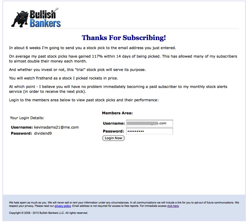
After you enter your email, here’s where you’re taken:
(Click Image to Enlarge)
On the thank you page here, it’s interesting to see how they’ve done the ‘membership login’ info…pre-populating the login data so it’s just sooooo easy to go to the next step….
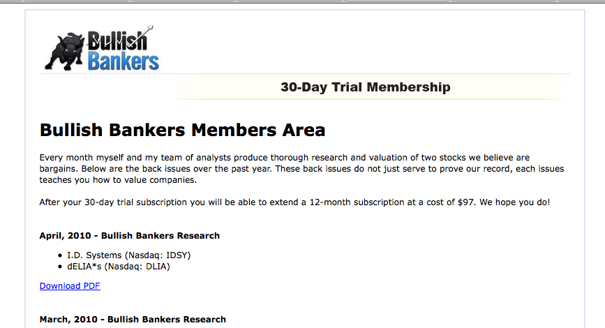
Here’s the “Member’s area:
Great, But Does it Convert?
No one knows for sure how this pipeline ultimately converts, and given that the site now seems to be abandoned perhaps it was a dud, although that could be due to factors other than the conversion funnel.
They’re also not capturing the credit card in the ‘free trial’ stage, but it could be that the raw number of people coming into the funnel is large enough to offset the ‘forgetful trial subscriber’ optimization.
When we were discussing this approach in the forums, Aaron brought up a good point as to the credit-card-collection-on-trial approach:
I wonder if on the inside if they had some sort of “bonus” which cost $1 and got the credit card data maybe that would help convert a lot more people, while still allowing for the huge numbers of free people upfront to sign up free?
It’s an interesting question. Simply because you didn’t get the credit card on the initial lead form doesn’t mean however that you couldn’t get it shortly afterward while they’re farther into the signup process…
Love it or hate it, the trend towards blurring content text and display ads with editorial will continue, and it’s interesting to see how some advertisers have started to take advantage of the opportunity.

