It can be frustrating, and expensive, to lose sales at the shopping cart stage.
Thankfully, shopping cart issues are typically a result of poor usability and poor process, and therefore reasonably easy to fix. The key to solving most shopping cart problems is to provide greater levels of transparency.
Let’s look at eight ways to super-charge your shopping cart conversions. We’ll use a cart you’re probably familiar with – Amazon’s – as an illustrative example.
1. Include Indication Of Progress

Without a progress report, a buyer can’t tell where they are in the shopping cart process, so it’s a good idea to spell it out.
Look at the way Amazon does their shopping cart, giving a graphic indication of the buyers position in the process. The buyer should also should be able to move forwards and backwards in the process in order to make changes.
2. Keep The Product In Front Of Buyers

When we buy in the offline world, we’re always connected to the item we’re purchasing.
It would feel strange to put a product we’ve decided to buy back on the shelf, go pay for it elsewhere, then come back to it a few days later. The disconnected feeling doesn’t provide a sense of ownership and belonging.
On the web, we can keep the product in front of buyers by providing an image/description of the product at all steps of the sale process, or a link back to the product page. When the buyer makes a purchase, send the buyer an email detailing their purchase.
Also, buyers like to re-check their purchases just before they hit the buy button, just in case they have made a mistake, or they’ve just thought of a feature they forgot to check. Make this back-navigation exercise difficult, and users will likely abandon the sales process.
3. KISS

Keep the sales process simple and obvious.
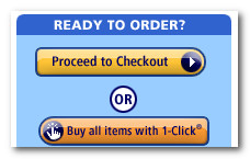
The sales process is not the place to let your designers get creative and cryptic. It should always be clear what action the visitor needs to take next in the form of “next” buttons or text. Whenever a user sees a new screen, that should be left in no doubt where they are in the sales process.
This is where testing is important. Watch how people step through the process, watch where they look, and watch for times where they appear indecisive.
4. Be Upfront About Shipping Costs

Many buyers won’t enter into a shopping process until they know the final cost in advance.
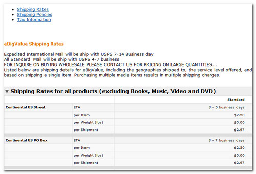
Let the buyer know the likely shipping cost before they enter the process. If shipping costs need to be calculated based on an address they give, then provide a link to a chart of typical shipping costs.
5. Make It Easy To Edit

Can the shopper edit the shopping cart?
One common reason for abandonment is the buyer feels they have made an error, but can’t see an easy way to rectify it. It’s best if the buyer can edit quantities and options at every stage, rather than having to navigate back.
If this is not possible, assure the buyer that they will be able to edit quantities etc on the final page before completion.
6. Address Security Concerns

The shopper is giving away personal information AND credit card details. A little voice inside their head will be warning them against sending such details to someone they know nothing about.
Think about ways you can reassure people. Make privacy policies available. Use secure processing. Use badges from business associations, and use third-party validation insignia. Assure shoppers with returns policies and purchase guarantees.
7. Include Your Phone Number
No matter how simple and complete you make the process, there will always be people who will be confused, or want to ask further questions.
If possible, give people the option to call. Alternatively, use a chat widget.
8. Save Option
No matter how streamlined your shopping process, people get distracted.
They may need to check some product details and come back. Does your shopping process allow people to save their progress? How about capturing their email address early, and sending them a reminder if there are items left in their cart, with instructions, and further incentives, to complete the process.


