As recently mentioned in Search Engine Land, Google has decided to move permanently to a new background color for their sponsored ads. When sampled, this color came up in Photoshop as #fbf0fa.

Aesthetic Angora added to image from http://evilmattcutts.com/
SEL quotes Google:
“The ads, which currently have a pale yellow background, will change to have a pale purple background. This change is part of the ‘look and feel’ update to our color palette and logo that we made back in May of this year to keep the Google results page looking fresh and modern. This is purely an aesthetic change to our ads and won’t have any impact on the way we target or serve advertisements on Google.com.”
OK. I mistakenly thought the point of the color is to visually indicate a separation between paid and organic results. Aesthetics aside, I would think this color has held a pretty specific function.
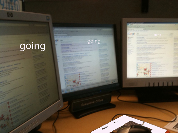
I noticed the change, because at work one of my 3 monitors could not display the color at all. I noticed it by its absence.
The video card it is connected to powers two monitors, so I could test. On one monitor, I could adjust the brightness and contrast to make #fbf0fa slightly visible. On the other, I can’t make it appear at all.
It definitely seemed to be a hardware issue, and tied to the display – something in one monitor’s mechanical limitations would not allow it to display the color. Not enough bits or something.
The Web Content Accessibility Guidelines in Guideline 2 suggests: “Don’t rely on color alone. Ensure that text and graphics are understandable when viewed without color.” Loretta Guarino Reid, a Google editor at the time, helped to write these guidelines in 2008.
Maybe that is why Google places the words “Sponsored links” at the top of the ads, so you can see it right away. Funny thing though, was that when the color disappeared, so did the clear distinction between the start of the organic and the end of the paid results.
Does It Really Matter?
On the surface, it would seem like a small issue. It’s only one monitor of my three, and the monitor is old. It would seem like Google is developing for the future visitors, using colors easily visible on all newer machines.
Indeed, the trends toward using wider, deeper, and more inclusive color palettes have been continuous. The W3C stats say: “The current trend is that most computers use 24 or 32 bits hardware to display 16,777,216 different colors. Older computers and laptops often use 16 bits display hardware. This gives a maximum of 65,536 different colors.”
However, this statement from the same definition is interesting: “Handheld computers (and very old computers) often use 8 bits color hardware. This gives a maximum of 256 colors.”
Hmmm.
So it seems that Google’s new aesthetics do not consider the potential effect of using colors unattainable on some handheld devices and older computers. I saw it – I know.
I found that the new color is not behaving like the light blue used behind the ads for years, or even the pale yellow that was in there for a while. Either of these colors rendered as slightly diminished and harder to see in my older setup, but I could adjust the contrast and brightness of the monitor display to see at least traces of them.
Not so, with the aesthetically pleasing #fbf0fa – it is completely invisible on the same older system.
Check out this image I saw on Jensense.com, from three years ago: http://www.jensense.com/archives/yellowadwords.jpg
Organic listings clearly delineated by using numbers? Preposterous!
A Different Test
While I was looking into why Google would choose a color from beyond the palette of web-safe colors, I found a good little tool. This one is for checking the compliance of the contrasting colors you’re considering to use online.
According again to the Web Content Accessibility Guidelines, “For colors to be compliant brightness should be above 125 and color difference should be above 500.”
Just to see, I entered in the values offered by Google’s new changes.
Foreground: #1111DB (Ad text color)
Background: #FBF0FA (Ad background color)
Brightness Difference: 204
Color Difference: 488
This combination is Not Compliant
Interesting choice, #fbf0fa.
Not compliant, and non-existent on some older machines or handhelds but aesthetically pleasing, you do have to admit it.
That is, if you can see it to comment.


